E-commerce web design tips: How to design a great e-shop (with examples)

You’ve got a product, you’ve worked relentlessly on your branding, you may have even identified your ideal target market and started ideating some killer ad campaigns, the only thing left to do is quickly whip up a website shopfront prototype, which is the easy part, right?
Well, sadly, it’s not as simple as that. E-commerce has changed dramatically over the last decade, as have the devices we use to interact digitally, and the reliance we have on certain device types. This has led to large shifts in customer expectations around online shopping, not just in terms of site usability, but also around security, responsiveness, and authenticity.
Essentially, the only way that your product is going to see the success you believe it deserves is if you design an e-commerce website with world-class UI and great conversion potential. Without this you might just find that your product launch lands with a whimper instead of lifting off with a bang.
So, how do you ensure that your e-commerce design does what it needs to and hits all those UX design best practices? Here is what you need to know about e-commerce web design, with a few helpful tips for perfecting your own shopfront along the way.

Skip to section:
What is e-commerce web design?
How web design impacts e-commerce
What makes a great e-commerce web design? (with examples)
5 tips for designing an e-commerce website
Design your web e-commerce site with Uizard
What is e-commerce web design?
Put plainly, e-commerce web design is the design of digital shopfronts to sell products to customers. More than that though, it is the consideration of how your customers will interact with your site, and how you intend to get them from point A to point B (consideration to conversion). But why is strong design so important to the success of your product?
Each year e-commerce becomes more prominent within the wider market, with Statista reporting that it will account for 20.4% of global retail sales by the end of 2022. With more and more businesses operating digitally, e-commerce is not only getting bigger, but the competition is getting fiercer.
Gone are the days of setting up a one-page website with a single ‘shop now’ CTA. If you want happy, converting customers then your e-commerce store needs to take a robust, user-first approach that is designed to instil trust and confidence whilst also promoting ease of access and streamlined user experience.
How web design impacts e-commerce
If your website is designed badly, you’ll soon find out about it once you get it in the hands of your prospective customers. From obtrusive light boxes to obscure user journeys, there is a myriad of pitfalls you’ll need to sidestep when designing your own e-commerce interface.
Bounce rates might not be your only problem though, if your design isn’t user-friendly and intuitive, you could be opening yourself up to a whole host of issues…
Web design and search visibility
How well your site functions can have a direct impact on the visibility of your site in search engines. If, for example, your site contains a mountain of heavy-duty assets that are taking a lifetime to load, or if you have links that are broken and lead a user to nowhere, it won’t be just your users that suffer.
Search engines use crawl bots to navigate your site to figure out what it’s all about, if they have a hard time navigating your e-commerce site, you will likely see a huge impact on your traffic potential and organic visibility down the line.
Web design and conversion rate
Sure, you might be able to get people through the door with enticing ad copy, smart social posting, or strong SEO strategy, but if your website is suffering from poor design (and therefore poor user experience), you will likely see a huge impact on your conversion rate.
Once you have customers onsite, you need to make it as easy as possible for them to find what they are looking for, and this won’t necessarily be your products or services in every instance.
Web design and brand image
Don’t expect a user’s experience with a badly designed website to end after they’ve bounced back off your site, you could be doing significant damage to your brand as well. Frustrate users enough and don’t expect them to come back... ever.
It might not stop there though; you should probably be prepared for a bad review or two on Trustpilot, or even a social media post decrying your dodgy design. Acquiring new users is the holy grail of growth for your brand, and users can only see your site for the first time once.
What makes a great e-commerce web design? (with examples)
What makes great e-commerce web design to an extent comes down to the type of product or service you are selling. By and large, however, the core principles of good web design remain the same regardless of your niche or vertical, that being a user-first approach designed to make your customer’s life as easy as possible.

A great way to test your own design outside of actually getting it in front of customers is to ask yourself some simple questions. Once you've designed your product in Uizard, you should reflect on the following:
- Can I easily find the information I am looking for?
- Does my design clearly demonstrate what I am selling or what my service is?
- Is the content easy to understand and interact with?
- Is it engaging?
- Does it look clean, smart, and enticing for a user?
- Are there any examples of unnecessary friction points?
- Are all the elements user-first/user-focused?
Of course, some of these questions you might not be able to answer at the prototyping stage, but it is important to have them in mind during the design process. To give you a clear idea of what we mean, here are some e-commerce web designs that we feel provide the right kind of answers to the above questions:
Ease of use/accessibility
A great example of strong accessibility in the wild world of e-commerce is ALLSAINTS, which demonstrates how useful links for the visually impaired and for those with cognitive impairment can still look stylish and fit with the wider aesthetic. The site also does a great job of utlising clear navigational elements, with core pages only a click or two from the homepage.
Style and substance
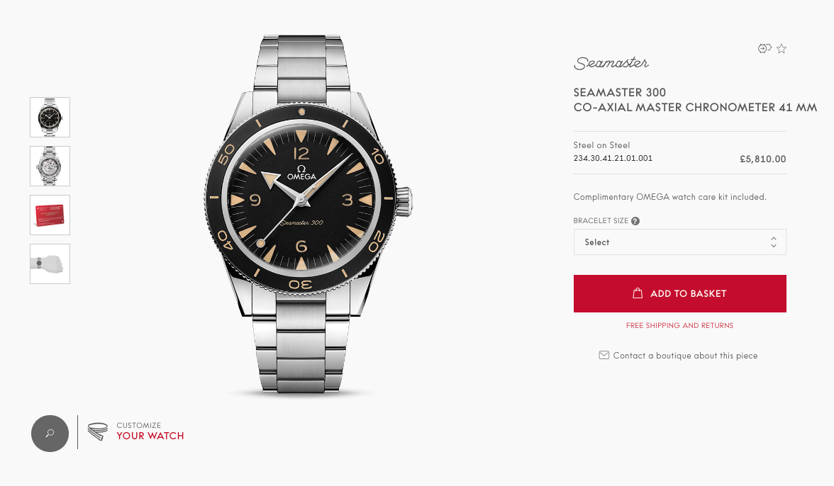
If you want to see how an e-commerce website should look, without sacrificing usability and accessibility, look no farther than the OMEGA watches website. With its clean navigation, clear CTAs, and streamlined user journeys, the OMEGA website combines strong UI with a stunning visual aesthetic, giving it a "best of both worlds" kind of vibe.

As well as promoting products in a clear and informative way, supplementary content has also not been ignored, which will be significantly improving experience for those customers not quite at the purchase stage of the buying funnel. Check out the site's editorial content for an example of what great, authoritative, supplementary pages should look like.
The importance of UI and iteration
So, how do you ensure your design wows your customers instead of ending up on a scrap heap in the junkyard of bad design? Our advice, keep it simple, design with a user-first mindset, and iterate, iterate, iterate!
User testing is the most powerful tool you have in early-stage design. If you can get your website design under the noses of potential customers, or even under the noses of colleagues or team members, then you are way ahead of the game.
Great e-commerce design is predicated on users being able to navigate your site easily and naturally, if you can gather this insight for your own design through the process of iteration you stand a much better chance of getting it to where you need it to be.
In summary, test everything. If something doesn't work for users or provides extra layers of friction, fix it and test it again.
Our top 5 tips for designing an e-commerce website
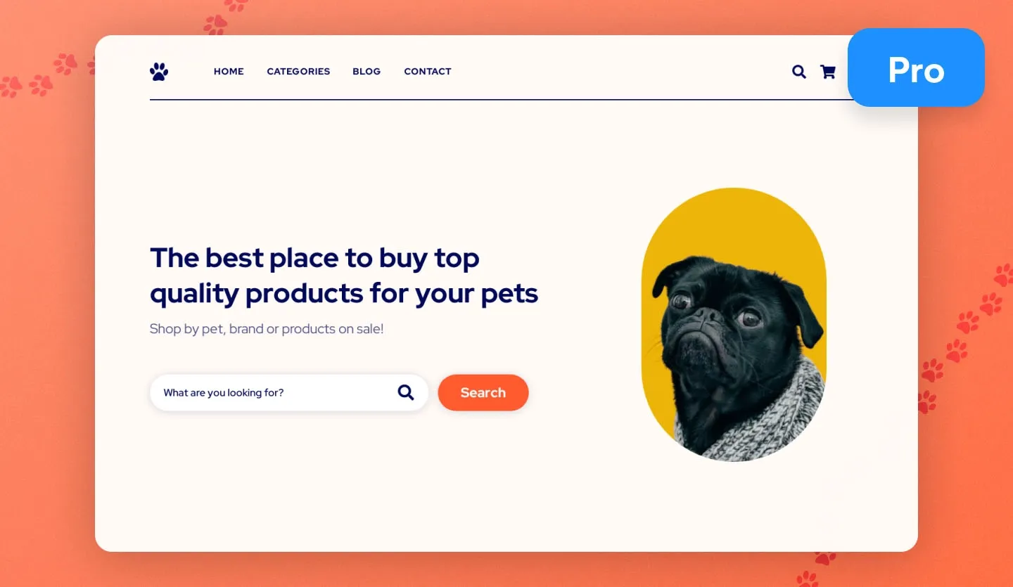
There might be a lot of design pitfalls out there, but there are ways to ensure you hit the core touch points of great design for your own projects. The easiest way to get your design on track is to use a Uizard template for your design, which comes with all UI and UX considerations baked in. We even have a specialized e-commerce web UI template to really streamline your project.
If you are starting your design from scratch in Uizard though, here are five tips to keep you firmly on track with e-store design...
- Keep it simple - don't over complicate your design for the sake of it, always keep your potential users in mind with any decisions you make
- Centralize your product - this might sound obvious, but your product should be front and center, especially on your homepage
- Reduce friction - friction is anything that prevents users from getting what they want out of you, try and reduce unneccesary steps in the user journey, and eliminate misleading links or obtrusive pop-ups
- Be consistent - ensure that your stylisation and themes are uniform, a lack of consistancy can impact user trust
- Accessibility for the win - always make sure you consider accessiblity, it's crucial that your user experience is consistant across the board, regardless of device or user
Design your web e-commerce site with Uizard
Looking to get started with your own e-commerce storefront? If you have a product you want to get to market or a service you are passionate about providing to customers, Uizard is here to help you realize your dreams. Either start from scratch or use one of our UI templates and have a workable prototype ready in the blink of an eye.

Ready to try your hand at designing your own website? You can try Uizard for free right now and have a stunning, workable prototype in minutes. Want to find out more about the world of design? Head over to the Uizard blog to learn more.
