The ultimate guide to designing UI mockups

When you're new to the world of UI design, it’s easy to get confused by design terminology, after all, mockups, wireframes and prototypes can all seem very similar in the beginning. In reality, these three terms are different stages in one big design process. But where do they all fit in?
Let's keep things simple... wireframes are rough drafts or blueprints of an app or web page and usually come first in the design process. Next are mockups, which tend to be upscaled, higher-fidelity versions that demonstrate more clearly the visual style and sentiment of a UI design. Finally, a prototype is a high-fidelity and often interactive visualization of a product, with user journeys included.
Even with these clear definitions in mind, it's still easy to get confused. To make matters worse, you'll often see these terms used interchangeably or incorrectly out in the wild. Let's dive into a bit more detail about UI mockups and look at how designers can use mockup tools, such as Uizard, to create mockups for apps, websites, and digital products
UI design with Uizard
Skip to section:
How detailed should UI mockups be?
What a developer expects from your UI mockups
How to create great UI mockups (step-by-step)
Top tips for designing UI mockups
What is a UI mockup?
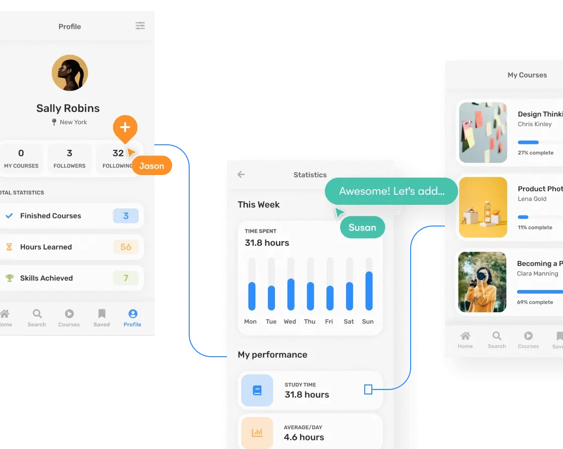
A UI mockup is a non-functional, static design of an app or web page used to show how different elements work together in the layout of a page design. But what do we mean by static? Well, as a UI mockup is a visualization of a final design; it isn’t interactive or functional.
Using UI mockups in your design process gives you and your team a chance to look at your project as objectively as possible (mockups can even be shared with external stakeholders or potential customers to gather early-stage feedback).
As a mockup is not a final design, there is room to change elements that don’t work and to try out various design ideas. Simply put, designers find mockups helpful as they allow them to play around with themes and layouts. Designers can then make sure that a page suits their brand’s aesthetics and needs. After a mockup is designed, and everyone is happy, this can then be taken to the next step in the design process — creating a prototype.
How detailed should UI mockups be?
A UI mockup acts as an aid to test out visual elements — to see what works, and what doesn’t. Basically, a mockup acts as a guide. That’s why it’s important to remember that nothing is set in stone at this stage of the design process, and changes can be made based on feedback.
However, creating a detailed UI mockup can be really beneficial. Attention to detail will help you and your team to properly visualize how your design will look in the hands of a user. We recommend starting with the basics, such as layouts, color schemes and styles, and then slowly increasing the detail of your mockup as you get more confident in what you're creating.
What a developer expects from your UI mockups
Presenting your UI mockup, or a set of mockups, to a developer may seem like a daunting task. But it doesn’t have to be. Your developer will expect you to have considered the user experience of your web or app design as much as the visual side. So what does that mean for you? Although your mockup will need to look great visually, it will also need to demonstrate functionality through on-page components, user flows etc.
Make sure you are considering aesthetics, user experience, and functionality when mocking up an app or webpage. Get it right and you can bet that your developer will be extremely happy when it comes to handoff.
How to create great UI mockups (step-by-step)
Designing a great UI mockup doesn’t need to be rocket science, and we believe that anyone can create an amazing mockup with the right tools. But how? Here's how to create stunning mockups in 5 simple steps:
- Choose a UI mockup tool
- Start with a wireframe, template, or AI
- Edit your design
- Collaborate with your team
- Consider your user journeys

Step one: Choose a UI mockup tool
Firstly, you are going to need to choose a app mockup tool. Now, there are various mockup tools on the market, so the one that you decide on will depend entirely on preference. These preferences could include things such as budget or functionality. Whichever UI mockup tool you pick, we promise it will make designing your UI mockup a great deal easier.
If you're looking for speed and ease of use, Uizard is the perfect UI mockup tool for any design project. Uizard boasts an easy-to-use, drag-and-drop editor, as well as a library of AI features to kickstart your UI design project like never before.
Step two: Start with a wireframe, template, or AI
Whether you are working on an an app design or something for web, you're probably going to want to kick off your project by jotting down a few basic ideas in the form of a wireframe. Wireframes are a great way to ensure you are testing early assumptions and validating ideas early on in the design process. If you're working as part of a team, this is crucially important for ensuring the success of your project in the long term; get everyone on board at the wireframing stage and you can be sure of smoother sailing later down the line.
To make things even easier, why not harness the power of AI for your project and really fast-track your success? Uizard's AI-powered Design Assistant can convert your hand-drawn wireframes into workable designs in seconds!
Step three: Edit your design
Once you have created your wireframe, or kickstarted your project with a template, you can now edit your design to truly bring your vision to life. How you edit your mockup really depends on your level of design skill and what UI design tool you're using.
Uizard, for example, provides simple drag-and-drop editing, which comes in handy when trying out new colors and layouts. It’s also super easy to move UI components around your mockup or add clickable links to demonstrate user journeys (although we're straying into prototype territory here).
Step four: Collaborate with your team
Unless you’re flying solo, collaborating with the rest of your team is going to be a top priority. Adding new users to your organization in Uizard, or sharing your design with others will mean that everyone gets to take part in the design process. You may even find that collaborating like this helps you to reach the final iteration of your mockup (or something close to it) a lot quicker.

With Uizard, collaboration is quick and simple. All you have to do is share the link to your project with your team… and that’s it! Work together to make your UI mockup dream a reality.
Step five: Consider your user journeys
An essential part of a UI mockup is demonstrating how your users will navigate through your app or website. Granted, your design will look great, but can users navigate it easily? For example, is it clear where they will end up if they click on a button? Keeping user experience in mind will help to bridge the gap between your UI mockup and finalized prototype.
Top tips for designing UI mockups
Even with a clear roadmap to UI mockup success, it's still easy to make a few mistakes along the way, especially when you're working as part of a large team with multiple stakeholders. Here are a few bonus tips for designing great UI mockups every single time...
Tip one: Make use of UI component testing
An important part of mockups are the user interface elements that you utilize, as these are going to have a direct impact on the usability (and therefore the success) of your design. With this in mind, it’s great idea to test out different types of UI components and test which ones have the best outcomes. With an easy-to-use drag-and-drop editor such as Uizard, it's super easy to swap out, edit, or update individual UI components to test what works best for your target market.
Tip two: Less is more
When it comes to mockups, it’s important to avoid overcrowding. Although an all-singing, all-dancing mockup might look visually great, you need to decide whether you've created something that is practical and accessible for users. Make use of whitespace, leave clear room for CTAs, and ensure you don't overwhelm you prospective users with cramped layouts or crazy font choices. For more info around UX guidelines in general, head over and check out our guide to the laws of UX design.
Tip three: Utilize AI to fast-track your UI mockup design
Make the most out of your time and dramatically reduce your resource burn by utilizing the power of AI.
Uizard Screenshot Scanner
Uizard has a library of AI design features to help you on the path to UI design greatness. Kickstart a new project with a simple text prompt with Uizard Autodesigner (COMING SOON), or import screenshots of other apps or websites with Screenshot Scanner to really get ahead of the game.
Ready to bring your ideas to life in magical high fidelity? Sign up to Uizard for free and design your own UI mockup for app, web, or tablet. Want to get ahead of the game? Explore our range of pre-made UI templates to really fast-track your design flow.
