iOS app design tips
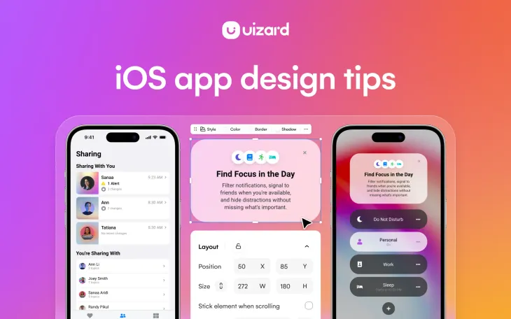
As you probably know, iOS mobile apps are located on the Apple App Store and are available to anyone with an iPhone. This means that when you come to create an iOS app design, it will need to fit the size of an iPhone screen, which is a lot easier compared to designing an app for multiple different devices.
Great iOS app designs are expected by users, but how exactly are they created? From ensuring that you pick the correct components, to achieving that perfect layout, this article will walk you through some key iOS app design tips.
Skip to section:
Following iOS app design guidelines
- Clutter free layout
- Use the color wheel to pick a color scheme
- Use color to show possible interactions
- Optimize for light and dark mode
- Select an appropriate font
- Typography best practices
- Use clickable touch screen elements
- Map the user flow between screens
- Use an iOS app design template
Following iOS app design guidelines
Apple wants to provide users with a safe, quality experience with the apps they download, and to enforce this they have compiled a list of guidelines. Featured in a broader document concerning the App Store review guidelines, there is an app design guidelines section. These guidelines are extensive, but there are three main ideas that can be taken away from Apple’s design section of their guidelines document:
-
Unique and original ideas: The App Store won’t accept copied app designs, which means that you need to come up with your own original design. Taking inspiration from other app designs is harmless, just don’t steal their app design completely.
-
Functionality levels: It may seem obvious, but your app design needs to be ‘app-like’, meaning that your design will need to resemble an app. Which is something that this article can help you achieve. It also needs to be relatively easy-to-use and understandable.
-
Picking an app design idea: Avoid opting for an app design category that is over-saturated. So if you’ve seen lots of other app designs that are based on an idea similar to yours, maybe think of a way to individualize it.
Apple experts will review your app design to check that it’s up to scratch. Ensuring that you stick to these three guidelines, along with Apple’s other rules, will show that you have done your bit in the app design process.
Tips for iOS app design
When creating an iOS app design there are a few things that should be considered. From a clutter free layout, to user flow mapping, the following tips will help you to make the best possible app design for iOS.
1. Clutter free layout
Keep your design clutter free to prevent users accidentally clicking on the wrong elements. Cramming in as many elements and components as you can may lead users to not wanting to use your iOS app design at all. So, adopting a simple design will avoid overwhelming your users.
2. Use the color wheel to pick a color scheme
A consistent color scheme is vital to every iOS app design. And there are a couple of ways you can decide on a color palette. Using the color wheel you have a few options for creating a color palette, namely: monochromatic and analogous color pairings.
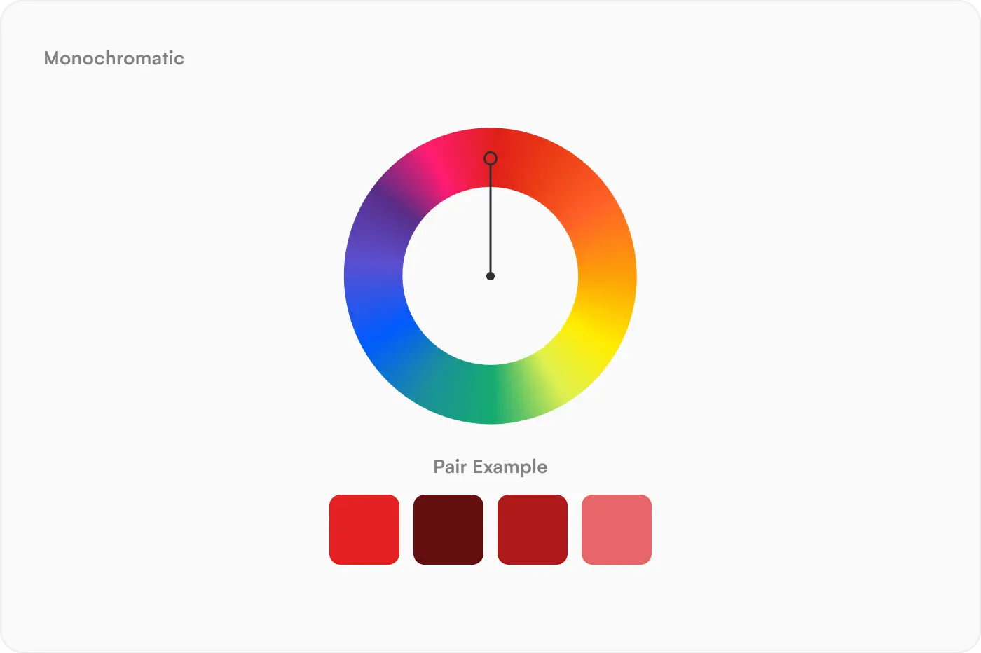
Monochromatic color palettes use various tones of one color. So if you decided that you wanted to use red in your design, you could use lighter and darker variations in your iOS app design. Whilst this doesn’t offer stark contrasts, it can be aesthetically pleasing for users.
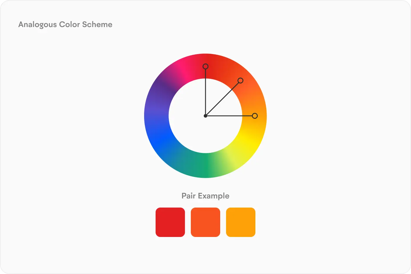
Another option is opting for analogous color schemes. Here you would pick three colors that sit next to one another on the color wheel. Red, orange and yellow is an example color scheme. Analogous colors provide a smooth contrast without being too intense for users.
3. Use color to show possible interactions
Color usage is a great way to show a user how to use your iOS app design. Using the same color to represent different interactions is confusing, instead opt for one color for the same interaction throughout your app design. Commonly, many app designs will use green and red to symbolize yes/no or accept/decline options. You can do this with colors of your choosing, or stick to what users are familiar with.
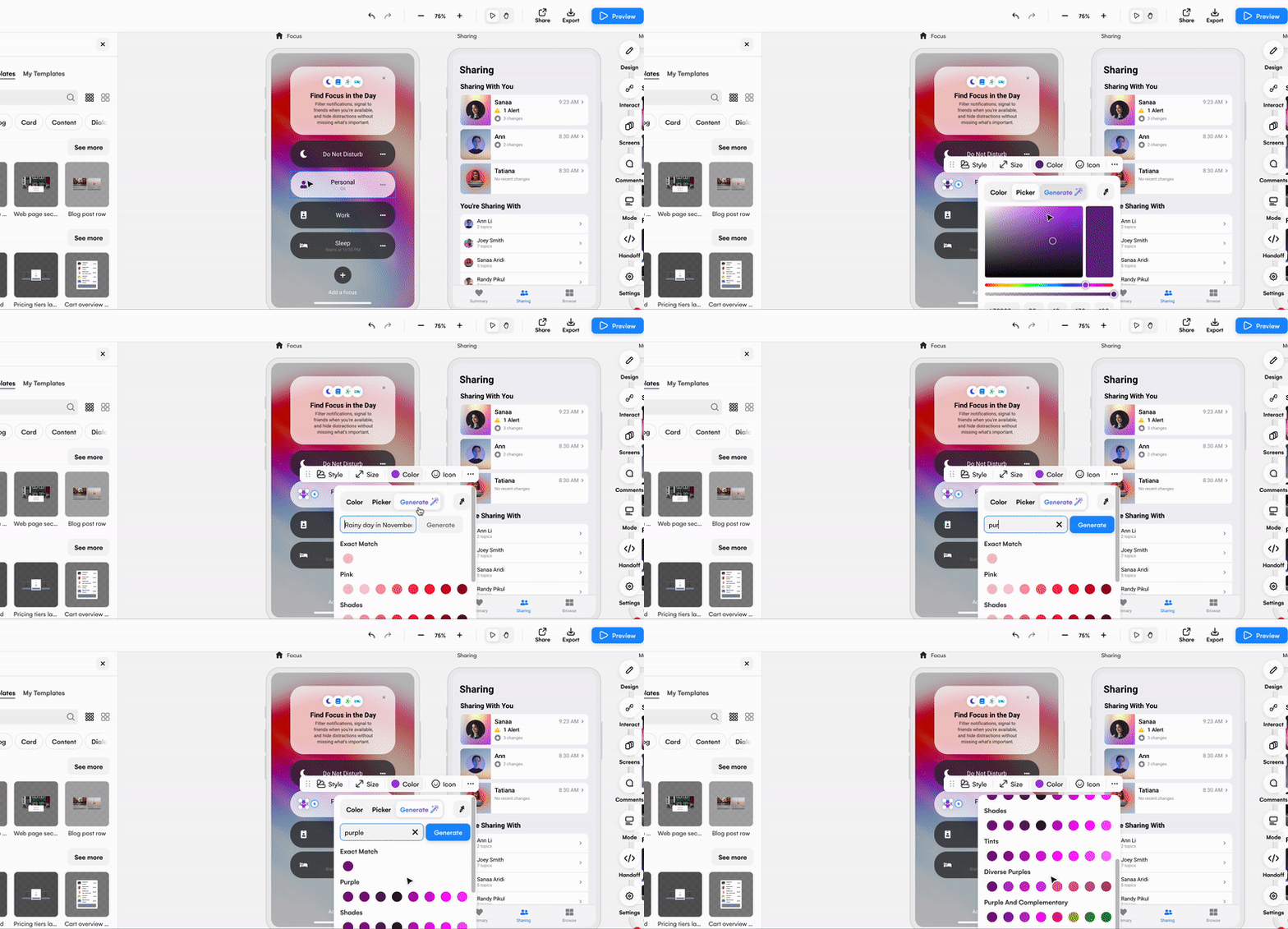
Unsure which colors to use for your buttons and other such elements? Well, if you’re designing with Uizard you can generate color palettes from prompts, or use the color picker tool to select the perfect color choice.
4. Optimize for light and dark mode
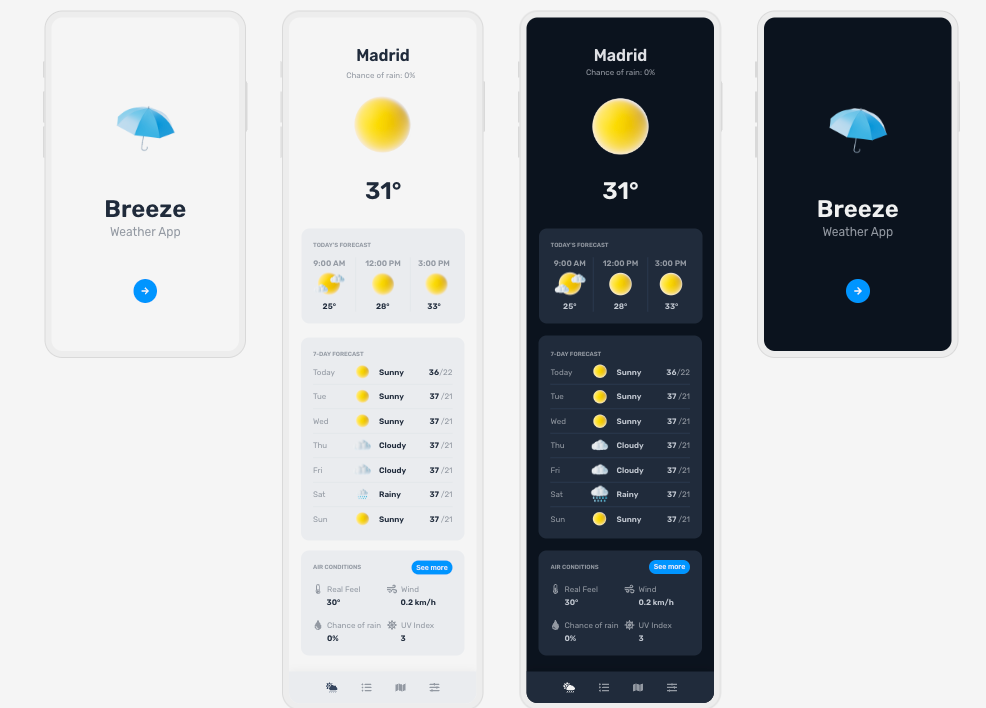
Adapt your iOS app design to light and dark mode to give users the choice between modes. With dark mode, you'll need to make sure that there is a sufficient contrast amongst the colors you use on your app design. Otherwise, users will struggle to use your app design properly in dark mode.
Using a Uizard template, you can easily create two app designs for both light and dark mode. Just take a look at the weather app design example below.
5. Select an appropriate font
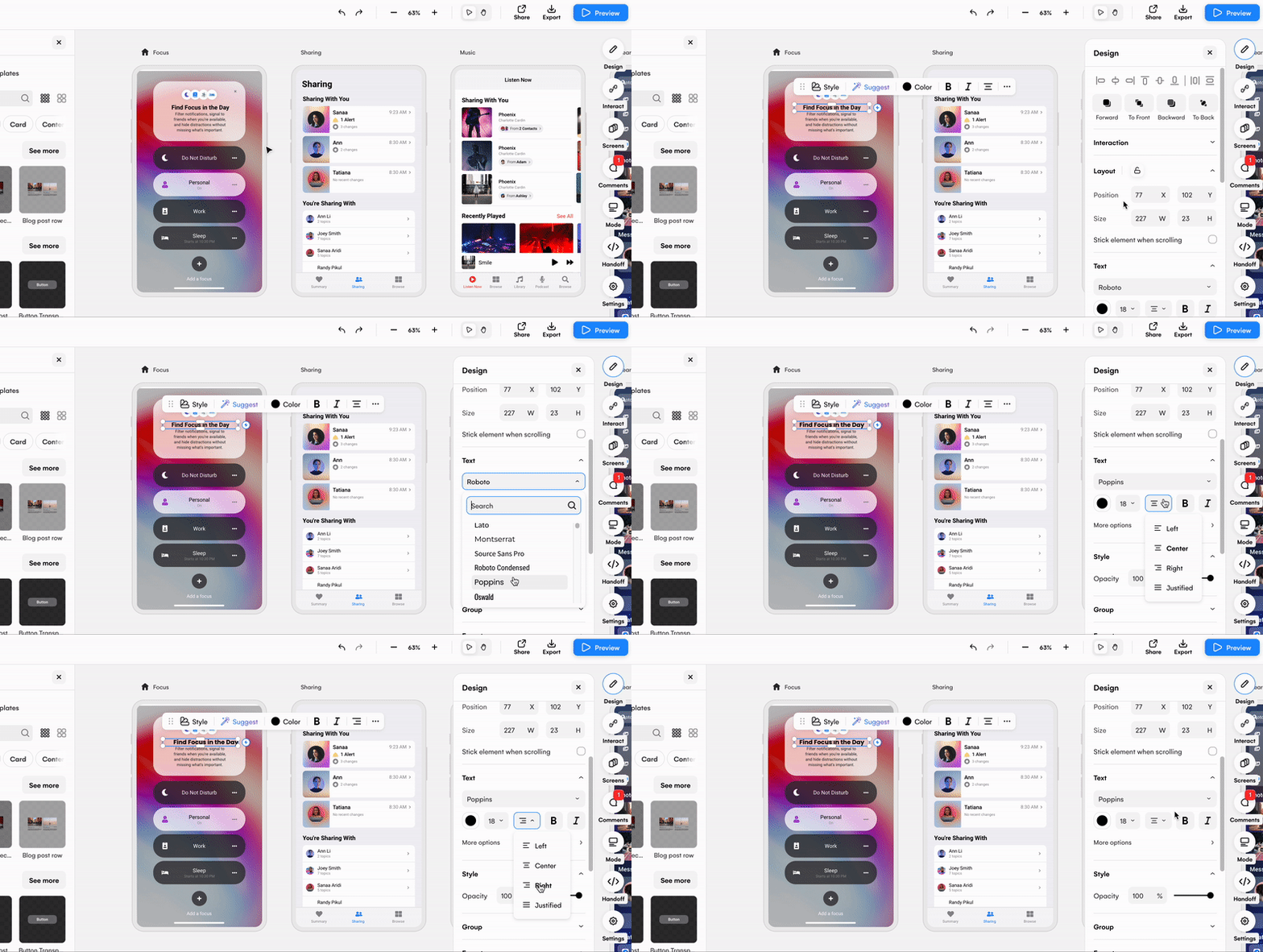
San Francisco and New York fonts are commonly used on Apple’s own iOS apps, so this is a great option for your app design. However, you can use others, just make sure that they’re readable. Editing text and changing fonts in your app design is easy in Uizard. Simply click on the text element you want to alter, and use the font drop down function under the text category to pick a new font.
6. Typography best practices
Typography is the art of creating aesthetically pleasing text, and this is essential for a good iOS app design. Sizing, spacing and alignment all feed into typography and can make or break the readability of the copy on your design. If a heading is too small, or the same size as a body of text, it will be ineffective at drawing a user’s attention to it. Instead, use a larger text size, a different alignment or swap up the text color to make it stand out.
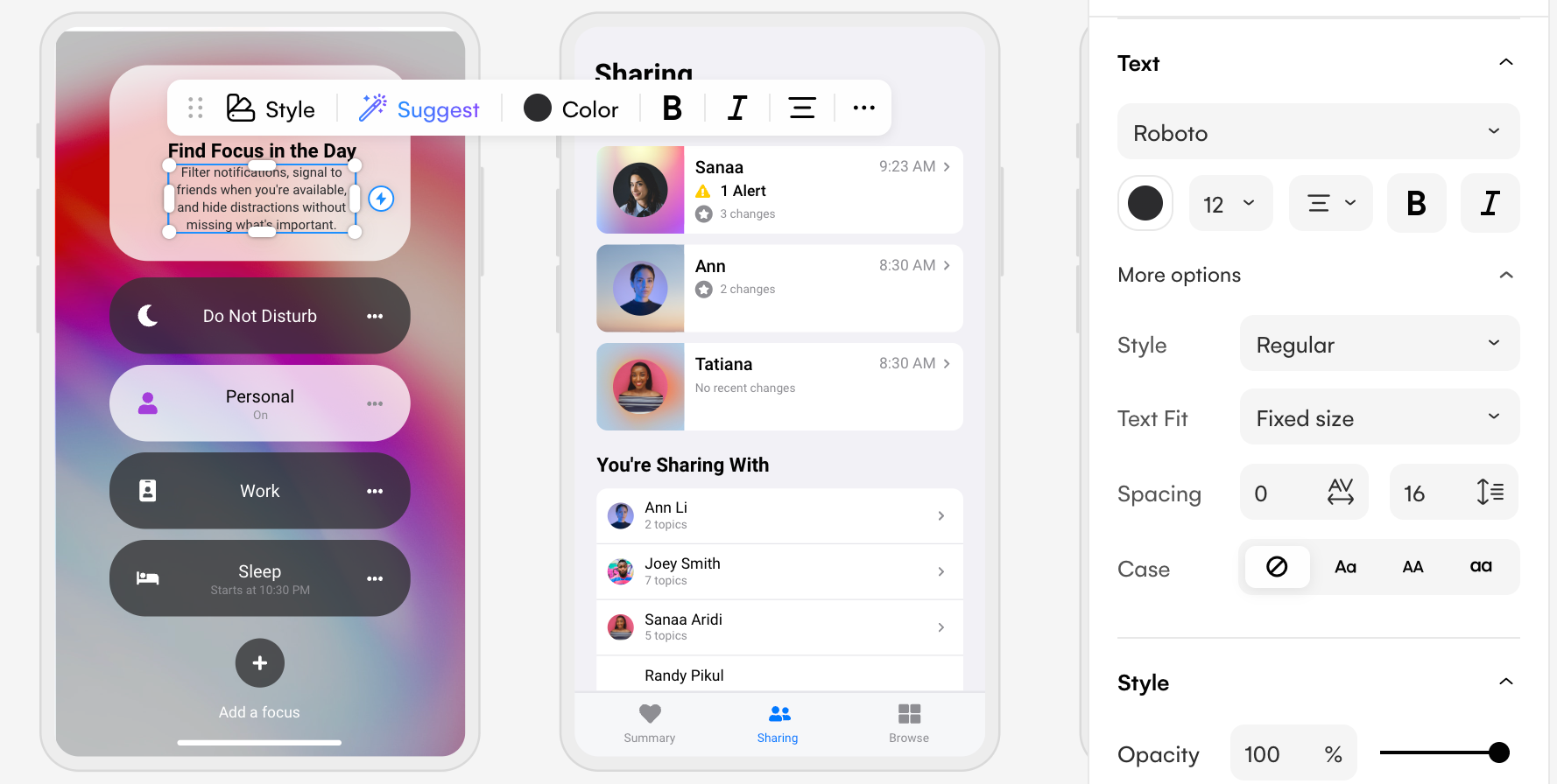
For readability, consider changing the spacing between letters, or the size of your text. With Uizard you can use the right design panel to complete this with ease. You can also edit the case, color and font too.
7. Use clickable touch screen elements
The spacing and sizing of elements will impact how clickable they are. If elements are too close to each other, or too small, users may struggle to tap on the right element. If you decide to use other elements such as checkboxes, toggles or sliders, make sure that these can be easily accessed and that there is an appropriate amount of space surrounding them.
8. Map the user flow between screens
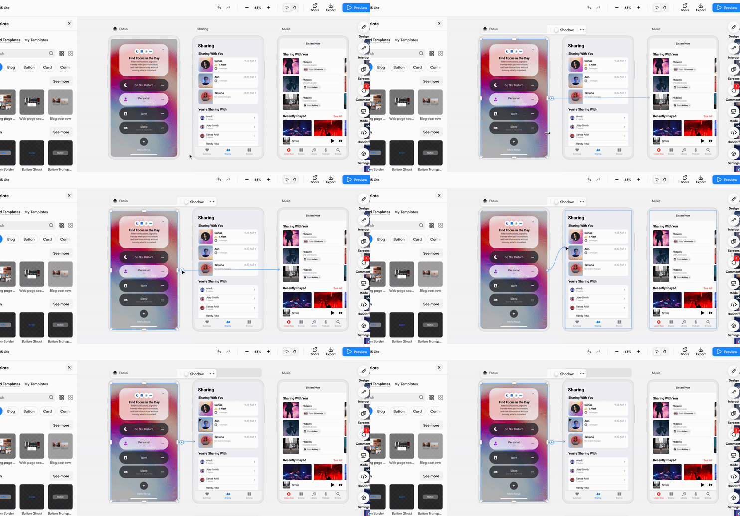
Between design screens, it’s important to map the user journey. This way you can test how a user would navigate your app design. Using an app design tool such as Uizard can help with this, as you can easily map the user flow from element to screen. All you have to do is click on the element you want to start with, and use the lightning bolt icon to connect it to another one of your design screens.
9. Use an iOS app design template
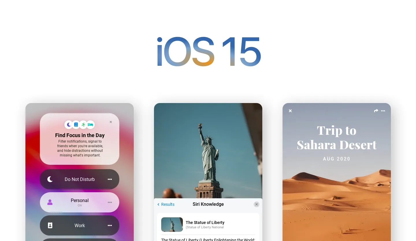
With Uizard, you have access to a template that can be used specifically for iOS app design. Within the template section of the Uizard platform you will find an iOS app template that can be used for iOS 15 and onwards. This template is the perfect starting point for any iOS app design, and you can customize it to fit your app project needs.
Use Uizard to complete your design journey
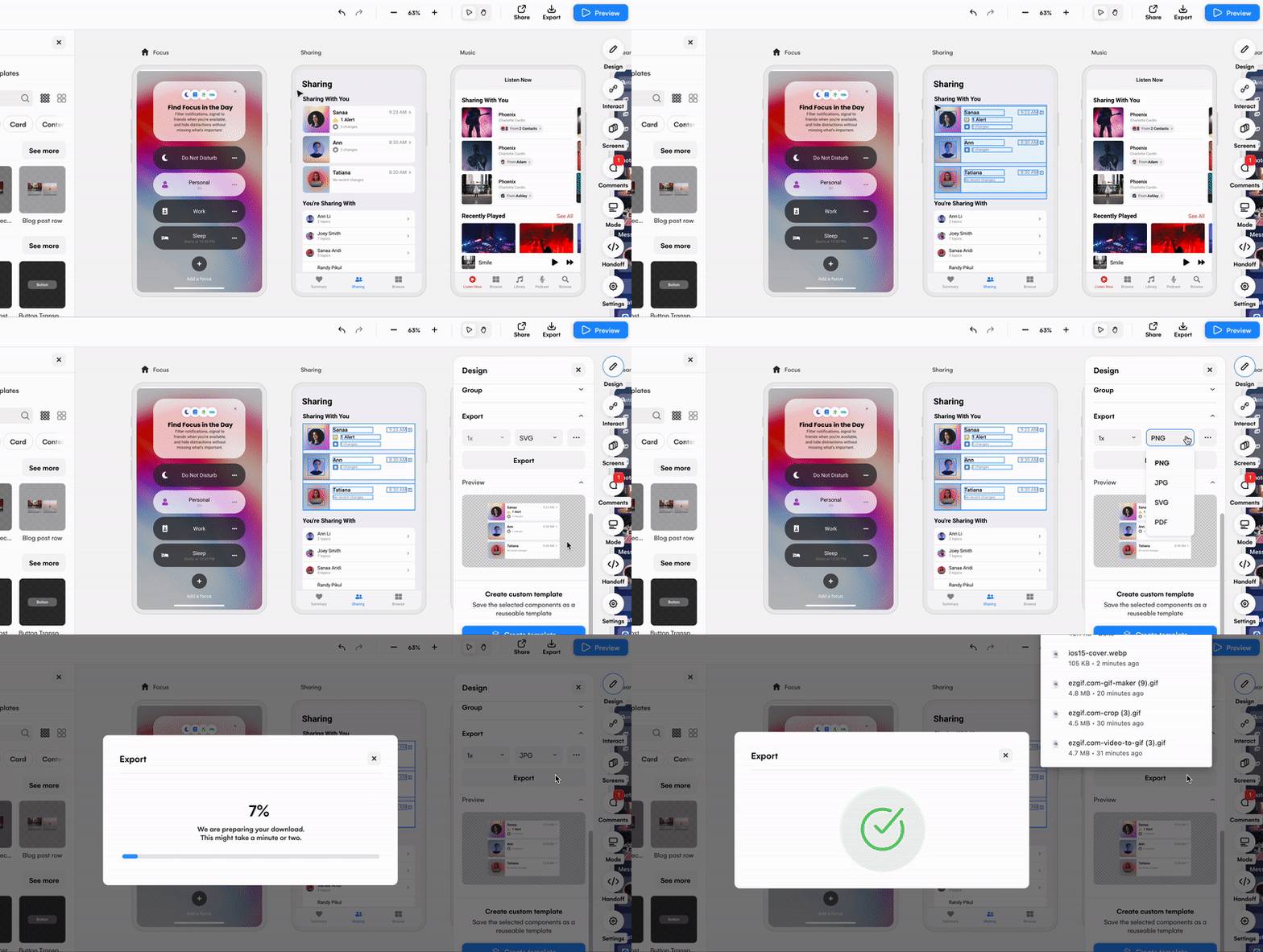
Your design experience with Uizard doesn’t stop when you’ve completed your prototype. Thanks to Uizard’s export function, you can download elements, components and whole screens in a range of formats. To do so, simply click on the part of your design you want to export, and use the right design panel to locate the export function.
Here you can view your possible export as a preview before using the drop down menu to decide on an export format. From PNG to JPG, SVG and PDF, you can pick the file type that’s best for you, click the ‘export’ button, and then use your design elsewhere. Import your designs onto other tools to complete your design journey and become one step closer to publishing your iOS app design.
Related reading:
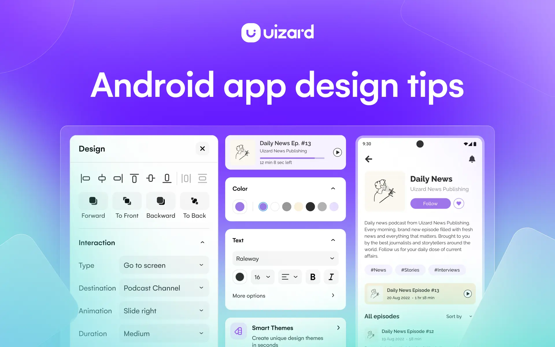
If you're looking to design an app for android, check out our guide below:
Get started on your iOS app design today using a Uizard template, or simply start from scratch. Sign up to a free or paid plan today. For more articles like this one, check out our blog.
