Low fidelity vs high fidelity wireframes: What’s the difference?

For those new to the world of wireframes and wireframing tools, the concept of fidelity can be a little intimidating and difficult to decipher. Even after you get to grips with what wireframe fidelity is, as soon as you hit even the most basic design discussion, you’ll likely find yourself confronted with overlapping and ambiguous uses of the term.
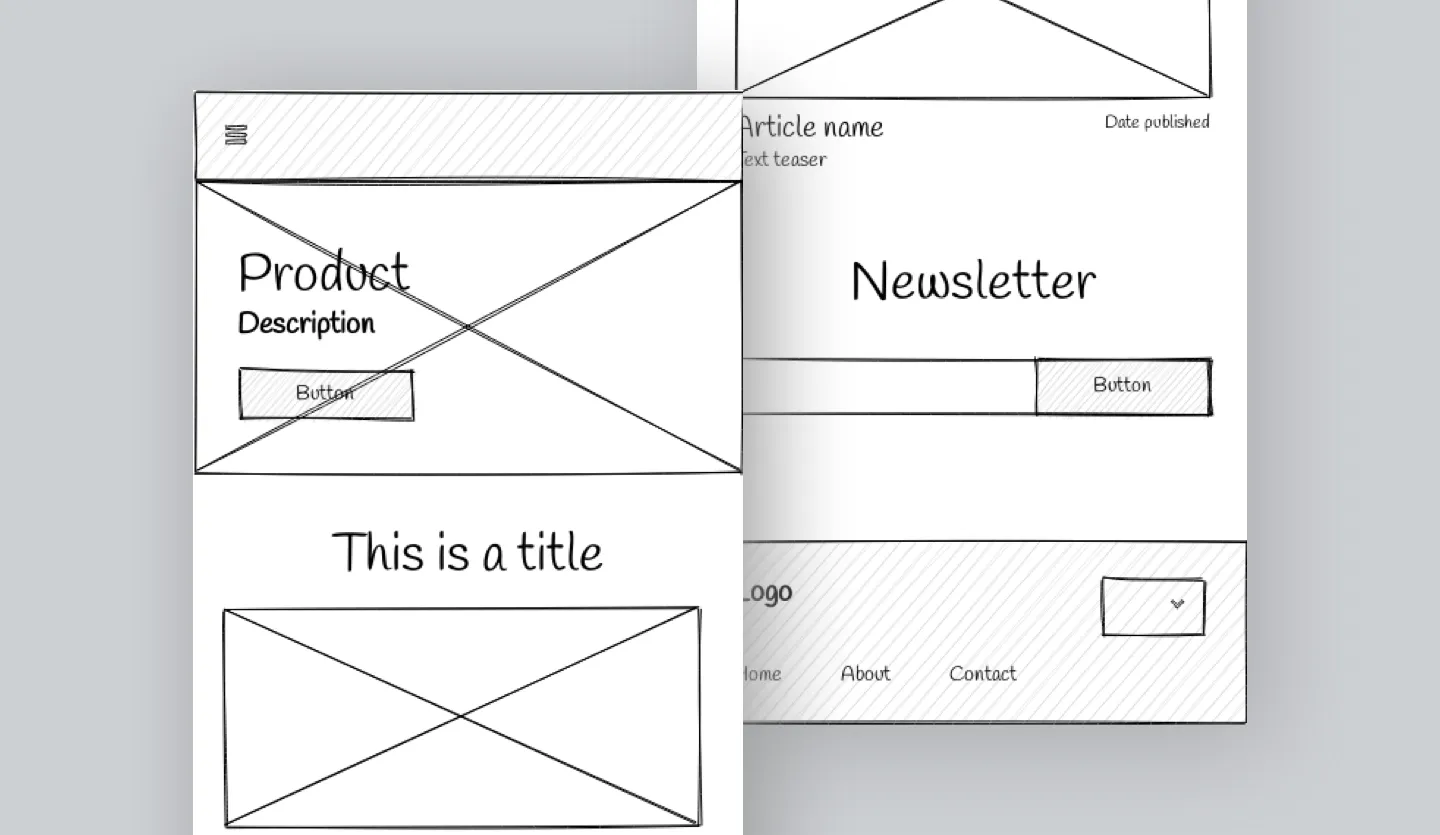
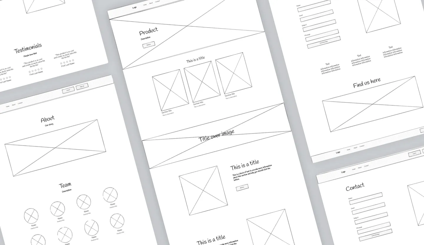
The best way to think of design fidelity is to picture it as a spectrum where lo fi wireframes are designed to demonstrate the core purpose of a design; they are sparse in detail with no functional elements. Conversely, higher fidelity designs introduce more detail and stylistic elements to convey how an app might actually look and function in the hand of a user.
Got more questions when it comes to app/website wireframes and fidelity? In this guide, we look at low fi wireframes vs. hi fidelity wireframes, what defines the level of fidelity, and at what point a higher fidelity wireframe technically becomes a prototype. Found yourself well and truly lost? Why not check out our guide to wireframes first and head back over once you've got to grips with the basics.

Skip to section:
What is fidelity in UX design?
What is a low fidelity wireframe?
What is a high fidelity wireframe?
What is fidelity in UX design?
UX design fidelity refers to how closely a design matches the look, feel, and functionality of a final product, whether that be an app design or something for web. The core areas that determine the level of fidelity are the structure of the design, the content included in the design, and the level of functionality of the design.
In layman’s terms, a lo fi wireframe will present as a basic illustration of a product’s intended layout and user journeys. On the other hand, a hi fi design will look as close to the finished product as is possible within the limitations of the UX design tool that is being used.
To keep things simple, in the table below we have outlined the core differences between low fi wireframing and hi fi wireframing:
| Low fidelity design | High fidelity design | |
|---|---|---|
| Structure (screens, navigational elements) |
Core landing pages are included (such as product pages, service pages, and a homepage). Low fi wireframe designs contain only minimal on-page elements to convey design purpose (e.g., navigation, core CTAs) |
All screens and on-page elements are included to convey the full scope and purpose of the design. Hi fi wireframe designs effectively emulate what the final product will look like to support testing and iteration. |
| Content (text, imagery, branding elements) |
Low fi wireframe design mockups contain little to no content and tend to be presented in greyscale. Instead of actual assets, low fidelity designs contain placeholder text and imagery. |
Hi fidelity wireframe designs contain all the imagery, editorial content, and branding elements the final product will contain. This will include headings, product copy, CTAs etc. |
| Interactivity (clickable links, fillable forms) |
Low fidelity wireframe designs are not functional in any way. Low fi wireframes may contain flow chart elements to demonstrate user flows instead (i.e., a wireflow). |
High fidelity wireframes tend to be fully functional (although there is some variation here). Within a hi fi wireframe, a user will be able to interact and click links as if they were using the real product. |
What is a low fidelity wireframe?
Low fidelity wireframes (or lo fi wireframes) are the most basic form of wireframe, they are created to outline the structure of a web page, app, or user interface. Lo fi wireframes help to communicate the core concept and value proposition of a product without including the finer details such as imagery and editorial copy.
Typically, low fi wireframes present as a greyscale schematic or blueprint and will only include the core features of an app or website. For a great example of a low fidelity wireframe, check out our website wireframe template which includes all the core features of a website design as well as a couple of the core user journeys.
When to use low fi wireframes
Low fidelity wireframes are quick and easy to create, making them perfect for early stage design ideation and concept sharing. There's also an extremely low barrier to entry when it comes to creating wireframes, meaning almost anyone can do it. If you really want to dial things right back, you can even hand draw your wireframes.
The best thing about low fi wireframes is how quickly you can turn them round. If you are a founder with a great idea for a product or service, you can design rapidly with your team to come up with the most viable solution and then iterate from there.

What is a high fidelity wireframe?
A high fidelity wireframe (or hi fi wireframe) reflects how a website or app will look in the hand of the user. Hi fidelity wireframes include all the content, stylistic elements, editorial copy, and branding that the finished product will include to really convey what a product will look like.
Although we can describe a design with this level of fidelity as a high fidelity wireframe, in reality, at this point you are more dealing with a digital product mockup. Once you then add in functional user journeys and clickable areas to your hi fi wireframes, in practical terms, you are dealing with a functional prototype.
Confusion around these terms can be fairly commonplace within design discussions, especially if a team doesn't include a professional designer.
When to use hi fi wireframes
Once you have your app or website structure built out in low fidelity, you can then enrich the content and add in all your user flows to really bring your design to life and transform it into a hi fidelity wireframe. Hi fi wireframes look something close to your finished product which makes them great for early-stage testing.
With wireframing tools like Uizard, you can easily share your functional designs with internal and external stakeholders as well as actual customers to gain valuable feedback on your product. The benefit here is that you can iterate based on this feedback before having to even build a version of your final product.
Wireframing with Uizard
Ready to bring your app or website idea to life? Uizard’s AI-powered features are here to support you right through the wireframing process, from lo fi to hi fi, faster than ever before. Regardless of what type of app you are designing, you can take advantage of one of our many UI design templates to really fast-track your UX design flow.
Feeling creative? You can sketch out your wireframe by hand and convert it to digital using our AI design features. From here, you can convert your basic wireframe into high fidelity and easily add in your user flows and click journeys to bring your functional prototype to life.
Got more questions when it comes to the world of wireframing software? We talk all over on the Uizard blog. Ready to put your skills to the test? Sign up to Uizard for free and start wireframing your next digital product now.
